Dashboard
Real-time and historical widgets, customised to your team.
The dashboard is where you watch your call centre in motion. It's a grid of widgets — each one a focused view of a single metric — and you decide which ones appear, in what order, and for which slice of your team. Pick a handful for the wall-mounted monitor, build a deeper layout for your own screen, and let everything refresh on its own while calls come in.
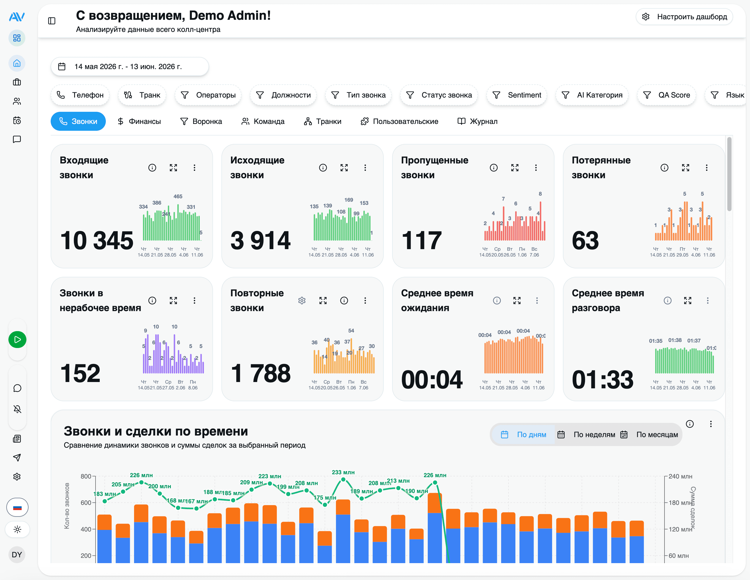
Every widget reads from the same replicated call data Astervis already collects from your PBX, so there's nothing extra to set up. Open the dashboard and start arranging.
Widgets show numeric values only — no currency symbols or codes. A "200" on the average-sale-price widget is two hundred in your own currency. This keeps the same layout readable for every customer regardless of where they operate.
Widget categories
Widgets are grouped by what they measure. You can mix freely across groups — a single layout might pair a call-volume heatmap with a QA-score gauge and a missed-calls counter.
Call volume
Incoming, outgoing and combined call counts, intensity heatmaps and hourly breakdowns.
Missed & lost calls
Calls that went unanswered, calls dropped before pickup, and callback follow-through.
Operators
Per-operator performance, leaderboards and operator-by-trunk views.
Wait time
Average time callers waited before being answered.
Trunks / lines
Compare, heatmap and load-balance your SIP trunks.
Sales (from CRM)
Deal counts, average sale price and top incoming numbers — sourced from your CRM integration.
AI insight
Sentiment distribution, QA score, and category / language breakdowns from AI analysis.
Call volume
The bread and butter of any call-centre view. These widgets count calls over your selected period and split them by direction:
- Incoming, outgoing, combined — running totals with a comparison against the previous period, so you see at a glance whether today is busier than yesterday.
- Total-calls distribution — the proportion of incoming vs outgoing.
- Call-intensity heatmap and hourly report — when calls actually land, by hour and by hour-of-weekday, so you can line up staffing with demand.
Missed & lost calls
The widgets supervisors check first thing in the morning:
- Missed calls — calls that rang an operator but weren't answered.
- Lost calls — calls that dropped while still in the queue, before anyone picked up. These are the callers you never got to speak to.
- Missed-calls callback and last missed calls — track how many missed callers you've already rung back, and surface the most recent ones to action now.
Operators
How your team is performing, individually and against each other:
- Operator performance and calls by operator — calls handled, plus average talk and wait times per agent.
- Leaders and leaders dynamics — a leaderboard of your most active operators, and how that ranking shifts over time.
- Operator-trunk performance — which agents are working which lines.
Wait time
Average wait time with a detail drill-down — the single number that tells you whether callers are getting through quickly or sitting in the queue.
Trunks / lines
For anyone managing carrier capacity:
- Trunk comparison, trunk heatmap, trunk load distribution — spot an overloaded line or an idle one.
- Trunk summary and trunk timeline — totals and activity over the day.
Sales (from CRM)
When you've connected a CRM integration (Bitrix24 or amoCRM), closed deals flow into the analytics store and power sales widgets:
- Deals count — how many deals closed in the period, with a detail view.
- Average sale price — the mean deal value (a plain number, no currency symbol).
- Top incoming numbers — the phone numbers that turned into the most business.
Sales widgets stay empty until a CRM integration is set up and has synced deals. See Integrations to connect one.
AI widgets
If your plan includes AI Call Analytics, analysed calls add a layer of qualitative insight on top of the raw counts:
- Sentiment distribution — the split of positive, neutral and negative calls.
- QA score — the average 0–100 quality score against your rubric. For the full breakdown — per-operator tables, per-criterion averages and anomalies — open the dedicated QA Analytics dashboard.
- Category breakdown — how calls divide across sales, support, complaint, inquiry, follow-up and other.
- Language breakdown — which languages your calls are actually in (Russian, Uzbek and English are first-class; others are detected too).
AI widgets only have data once analysis is enabled and calls have been processed. With AI off, the rest of the dashboard works exactly the same.
Customising your view
The dashboard is yours to shape. Enter edit mode, change the layout, and save — your arrangement is remembered for next time.
Enter edit mode
Click Edit in the top-right corner. The grid becomes draggable and each widget grows handles.
Add a widget
Click Add Widget, then browse or search the catalogue by name. Click a widget to drop it onto the grid.
Rearrange
Drag widgets to reorder them. Bigger numbers up top, supporting charts below — put what your team glances at most where the eye lands first.
Remove
Click the × on any widget you don't need.
Save
Click Save to keep the layout. Prefer the stock arrangement? Reset Layout restores the defaults at any time.
Filtering
Every widget respects the dashboard filters, so you can re-point the whole view at once:
- Date range — pick start and end dates. Turn on period comparison to see each metric against the equivalent prior window.
- Operator — focus on one or more agents.
- Position / team — narrow to a department or shift.
Tags
Widgets carry tags (Calls, Operators, Analytics, Trunks, Sales, and so on). Use the tag filter to show only the widgets in a category — handy when you've built a large layout and want to concentrate on, say, just the trunk widgets during a capacity review.
Real-time refresh
Widgets update on their own as call events arrive — usually within seconds, so there's no manual refresh button to hunt for. You can tune how often live widgets poll if you'd rather trade a little freshness for a lighter load on a shared display.
Leave the dashboard open on a screen and it stays current all day. New calls, callbacks and completed analyses appear without anyone touching it.
Admin vs operator views
The dashboard is role-aware. What you see depends on the permissions attached to your account.
Full access to the widget catalogue: team-wide call volume, every operator's performance, trunk and sales widgets, AI insight, and the QA Analytics dashboard. Build and save layouts for the whole team, compare operators against each other, and drill into any individual.
Roles and what each can see are governed by Astervis's permission system. An administrator can grant or restrict access per role — see Roles & Permissions.
Where to go next
Last updated on